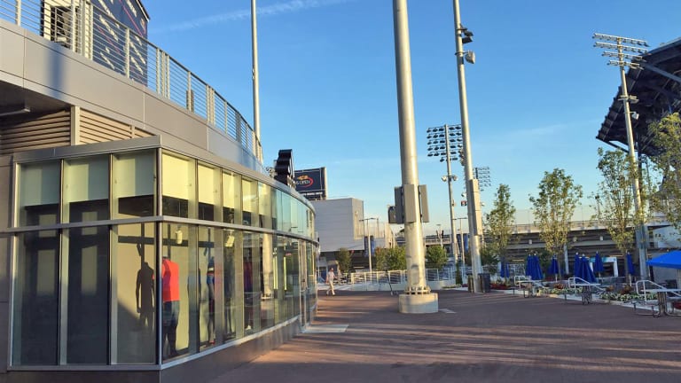
NEW YORK—So much can be done with an extra 30 feet of space, not to mention enough land to place a brand new 8,100-seat stadium.

Much of the focus on U.S. Open venues has centered on the new $150 million retractable roof playing like an umbrella over the 23,000-seat Arthur Ashe Stadium—the world’s largest tennis venue—and the brand new Grandstand. But a less discussed third piece of the design from Detroit-based Rossetti— the original architects of the Billie Jean King National Tennis Center and the current architectural caretakers—made it all possible.

“Frankly, it starts with circulation,” architect Matt Rossetti told TENNIS.com. “In the master plan, the number one issue was circulation. You are not going to be able to solve anything else until you have a solution for that. That is where all the creature comforts for the fans start.”

First, the USTA was able to expand into already earmarked land—unused property in the southwest corner—for the completely new interpretation of the Grandstand, a vast departure from the previous stadium of the same name. Moving the Grandstand was only the first step. One of the most important pieces, Rossetti said, was expanding the south border between the tennis center and the rest of Corona Park by 30 feet. That border tweak allowed for the shifting of outlying courts in a completely new design, a new 40-foot-wide pedestrian thoroughfare and a reinventing of the central plaza, now 50 percent wider and 50 percent deeper.

“No longer are you shoehorned in,” Rossetti said. You are able to celebrate (tennis) and come hang out. It is the heart and soul of the site.”
Advertising

There are new ways to experience the U.S. Open, and it's only just begun

There are new ways to experience the U.S. Open, and it's only just begun

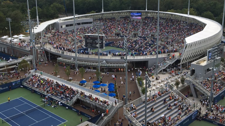
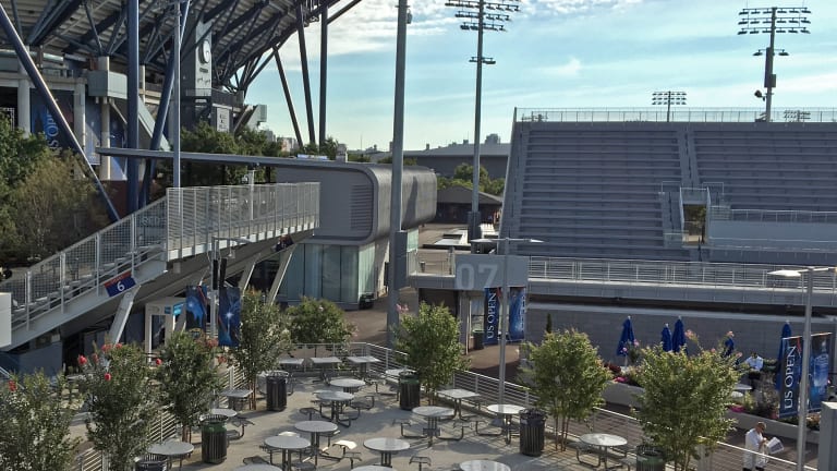
The larger plaza creates space for circulation, congregation, relaxing and eating. A tiered portion of the plaza features both tables and chairs, and wide-open artificial turf—natural grass gets trampled into dirt within a few days—that invites naps and lounging, Rossetti said. The two styles of pavers used encourage fans either toward sponsor sections, or into the slower, tree-lined areas for relaxing.

“The Grandstand was the front end of recognizing we needed to do something about open space on the site,” Daniel Zausner, the chief operating officer of the Billie Jean King National Tennis Center, told TENNIS.com. “We took 8,000 people from the northeast corner and moved 20 percent of the congestion to an area [where] there was a 50-car parking lot before.

"People are spread out all over the campus and no zone looks crazy crowded.”

The new promenade connects the Grandstand and Court 17—which opened in 2011—both of which were designed with a round shape. (The Grandstand is technically 16-sided, but it appears round visually.) That’s quite different from the octagon that is Ashe and the future rectangular design of Louis Armstrong Stadium.

“Round was a geometry play,” Rossetti said. “We were trying to create a diversity of shapes, and each shape works perfectly for the site.”

With the evolution of the tennis center coming in three stages—stage two, by far the largest, opened for this year’s tournament and expanded the site from 42 to 46 acres, and stage three includes a new Louis Armstrong Stadium and a remaking of the northeast corner—everything but the yet-untouched northeast corner comes new. New concrete. New benches. New trees. Everything is brand new.

Along with new furnishings comes a completely new design aesthetic. When originally crafted, Rossetti said the site was all about United States tennis, so they used red terra cotta, blue steel and white trim.

“In 2010 we decided it was a tired look, and it was time to reshape it,” he said. “We wanted a more sophisticated palette.”

The new look, seen most heavily on all the new field and small-stadium courts—such as courts 8-10 and 13-16, as well as 11 and 12—bathes the site in shades of gray, steel, glass, galvanized metals and stone.

“It is a fresh, new tone,” Rossetti said. “And it is durable.”

Advertising

There are new ways to experience the U.S. Open, and it's only just begun

There are new ways to experience the U.S. Open, and it's only just begun

By creating stadium seating for the shifted courts on both the south and west side—including thousands of viewing spots for five practice courts adjacent to three championship courts—Rossetti also built sponsorship programming opportunities on the underside of the stadiums, all facing the central plaza or a main walkway. The design moves those retail, food or sponsor activations away from cheesy kiosks that crowd walkways, and gives those who lease the space a more permanent location while offering more freedom of movement for fans.

“It is all about being vertical,” Zausner says. “Everything has to be up for us.”

Going vertical creates that extra space, giving the sponsors more usable activation space

“Now there are two-story structures, with fans on the second floor migrating to them all day long,” he said. “We just didn’t have that flexibility before. We would have 100 fans clawing against a fence, and now we have hundreds in comfortable seats with suns on the back. It is how we utilize our footprint without getting a bigger footprint.”

The Grandstand plays into this motif, too, with a large retail shop serving as the front door to the venue.

By connecting the vendor spaces below the stadium, Rossetti also connected walkways above it, allowing free movement from elevated positions.

“We connected all the courts so you can bounce between them,” he said. “It is a cool position to have. Elevated positions are really big, as people love to take it all in.”

The new Grandstand continues the theme of elevation and circulation, with an asymmetrical design that rises in the southwest corner of the site and dips opposite that for views from the upper walkway back into the grounds. Fans on Ashe’s concourse can even look into the Grandstand.

“There is a great dialogue going on between Ashe and Grandstand,” Rossetti says.

Advertising

There are new ways to experience the U.S. Open, and it's only just begun

There are new ways to experience the U.S. Open, and it's only just begun

A wide upper walkway wraps around the Grandstand and allows a variety of views of the grounds, as well as of the stadium’s court, which dips 18 feet below grade to keep the Grandstand’s profile lower. The main concourse provides 360-degree circulation and includes multiple food court options—one with a peekaboo surprise that opens the backside of the stadium directly onto grass so folks can eat their food there—while spilling onto an entirely new plaza that connects back to Courts 4, 5 and 6.

“Before, we had eight-foot or 10-foot walkways that weren’t connected,” Zausner says. “It created a logjam. We wanted to have a straight line. Now we have created that thoroughfare, and everywhere you turn there is an opportunity for people to find their own destination.”

The varying levels, diversity of points of sales, and views and openness of the Grandstand tie neatly with the rest of the site’s circulation improvements. And with Armstrong and the northeast corner—everything from the NikeCourt store and beyond—getting a refresh by 2018, we’ve only just seen the start of what the National Tennis Center can do with an extra 30 feet of space.

Tim Newcomb covers sneakers for Tennis Magazine. Follow him on Twitter at @tdnewcomb.